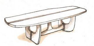

The Conference Table was designed by Andrew W. Palmer, John H. Norton, and Michael A. Goldfinger for use in large rooms in office settings. Its organic shape encourages user interaction spanning the entirety of its 120 inch length. The table’s 42 inch width offers a significant amount of workspace and room for large presentations. Because of the practical form of the Conference Table, its influence can be seen in offices across the globe.
The 1970s saw the beginnings of the modern business place, with the erection of the Sears Tower (Graham, Chicago), John Hancock Center (Graham, Chicago), and the World Trade Center towers (Yamasaki, New York). New forms emerged in all disciplines of design as a result of advances in material technology. Innovative material use and construction resulted from America’s participation in the Vietnam War, while the US/ USSR space race brought about a keen interest in flight.
The 1975 Conference Table integrates naturally into the setting of a 1970s office. The table’s form challenges conventional table design to produce a buoyant, dynamic form. The Conference Table could be paired with Eero Saarinen’s Tulip Chairs (1955-56), which share with the table a sense of airy fluidity. Equally appropriate to the table’s design are the rich patterns of Angela Adams. Her rich color and organic forms are relate to the environmental emphasis of the 1970s. To accent the space, Jo Hammerborg’s Saturn drum light (for Fog & Mørup, 1970) in combination with wood-paneled dropped fluorescent lights characterize the lighting design of this era.


Sources: DWR, Classic-modern, Knoll, Smithsonian, and printpattern


No comments:
Post a Comment