
Monday, October 13, 2008
My Artifact

Sheraton Tilt-top Dining Table

 The space I choose to place the Sheraton Tilt-top table in is the space in which it resides today. It is showcased in the Nichols house museum. It was designed in the late 1800's in England. This table in particular was designed for Rose Standish Nichols, and was used in her dining room. The hand built table sits a top a red, blue, and beige oriental rug. Being a fairly undecorated piece itself, the table can easily be adorned with runner, place settings, and flowers that correlate with the room. Its function is clearly to be a dining table, but can be easily transformed so that it is no longer functional as a table. The top of the table flips up that that it becomes parallel with the wall. The legs of the table have small wheels so it can be rolled to another place in the space. This creates other opportunities for how the space can be used because there is no longer a big table in the middle of the room.
Although the table is in the middle of the room, it is not particularly the centerpiece. There are many pieces of furniture, like hutches and side tables that are along the walls, along with several portraits. There is also a large fireplace at one end of the room that demands a lot of focus and attention. It is nice to see though that the painting, fireplace, table and chairs, and rug all work together to create a cohesive and collaborative dining room.
Similar: The table is placed in the fancy dining room and this is very similar to the John Betlter sofa that is placed in a luxurious parlor. Both items are seen in upper class homes.
Contrast: The Alexander Calder mobile that is placed in the National Gallery of Art is clearly in a very different location than the Nichols House Museum. The National Gallery is much more modern and simple, and it is not a house.
Sources: Nichols House Museum
Le Corbusier's Petite Loveseat


In the 1920s when Art Deco and Art Nouveau thrived as the popular design aesthetic, Le Corbusier and other designers took a totally different approach through partaking in modernism. Le Corbusier worked with stainless steal to create the solid frames of his LC2 collection, which was featured in the 1929 Salon d’Automne.
In its original context the petite love seat was placed in a space considered the epitome of luxurious modernism. The space was a model apartment meant to showcase the works of designers such as Le Corbusier and the new materials of the time. Light was a key concept for the Salon d’Automne and this was achieved in the space through a glass floor and ceiling as well as furniture supported with tubular steal structure.
Today, reproductions of Le Corbusier’s original collection are sold to those who appreciate modern design. You can find reproductions of Le Corbusier’s petite loveseat from his LC2 collection selling for about 2,000 dollars online. The LC2 collection is practical yet stylish and sleek. A more wealthy family may use the collection in their living or family room for practical every day use. While many middle class Americans may simple marvel at the collection in their boss’s office or a friend’s stylish New York apartment. Because technology is such a large part of our culture today, pieces such as Corbusier’s petite loveseat, which was modeled after the machine, thrive in the modern environment. Furthermore, the classic minimalist style allows for the collection to look beautiful in almost all spaces from traditional to contemporary.
Sources:
http://hivemodern.com/products/?view=sub_product&sid=1132
http://cart.1929.co.uk/index.php?p=product&id=13&parent=2
http://www.designmuseum.org/design/charlotte-perriand
Murphy's bed in space
Murphy's bed can realte to the space in two different ways. During the day it functions as a cabinet against the wall. It doesn't take up much space and stays out of the way. This allows you to transform the room into a sitting area during the day. When the bed is folded up into the cabinet it feflects the murphy's bed practical and functional side. Once you unfold it the bed is more about luxury. When you wish to sleep you simply open the cabinet doors and pull the bed down. Most modern day Murphy beds come with lights and paintings built into the cabinet frame. As you unfold the bed it starts to transform the room into a more comfortable place. The soft lighting, paintings, and comfortable bed make the room feel more like a place to rest than a place of activity. It also effects the size of the room. When folded up the room would feel more open. When the bed is out it breaks up the space and the room becomes smaller and more centered. The Murphy bed also helps us relate the past o the present through it use of using the same space for two different purposes. In the past this was a necessity because of expansion. Today we find outselves wanting to be more sustainable and use less materials. Muphy's bed is perfect because it allows us to build less rooms. It also helps look to the future and gives us a sense that design should be stylish yet multi-functional.
pictures are coming as soon as blogger cooperates.

 The Victor 2 Humpback Phonograph can certainly be described as an artifact intended for the upper echelon of society. A common phonograph was already considered to be a luxury and was rarely found in lower class families. But the Victor 2, as it was larger, louder, and made of fine materials, was even more rare. And if that wasn’t enough, the Victor 2 could be customized specifically for the buyer. In this way, the Victor 2 was not just an appliance to listen to music through, but it also served as a symbol of wealth, class, and taste. To have a Victor 2 meant sophistication, that one listened to fine music and had a refined taste.
The 1970s Workplace
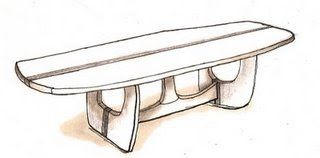

The Conference Table was designed by Andrew W. Palmer, John H. Norton, and Michael A. Goldfinger for use in large rooms in office settings. Its organic shape encourages user interaction spanning the entirety of its 120 inch length. The table’s 42 inch width offers a significant amount of workspace and room for large presentations. Because of the practical form of the Conference Table, its influence can be seen in offices across the globe.
The 1970s saw the beginnings of the modern business place, with the erection of the Sears Tower (Graham, Chicago), John Hancock Center (Graham, Chicago), and the World Trade Center towers (Yamasaki, New York). New forms emerged in all disciplines of design as a result of advances in material technology. Innovative material use and construction resulted from America’s participation in the Vietnam War, while the US/ USSR space race brought about a keen interest in flight.
The 1975 Conference Table integrates naturally into the setting of a 1970s office. The table’s form challenges conventional table design to produce a buoyant, dynamic form. The Conference Table could be paired with Eero Saarinen’s Tulip Chairs (1955-56), which share with the table a sense of airy fluidity. Equally appropriate to the table’s design are the rich patterns of Angela Adams. Her rich color and organic forms are relate to the environmental emphasis of the 1970s. To accent the space, Jo Hammerborg’s Saturn drum light (for Fog & Mørup, 1970) in combination with wood-paneled dropped fluorescent lights characterize the lighting design of this era.


Sources: DWR, Classic-modern, Knoll, Smithsonian, and printpattern
Marian Mahler Curtain Space:Lauren Thore


http://www.hgtv.com/decorating/art-deco-bedroom/index.html
18th c. german display(combinde)


A glass show case on a pedestal, containing sixteen German made porcelain figures from the 18th century that represent Italian comedians from the theater, is arranged in a gallery dedicated to displaying artifacts from Germany in the late half of the 18th century. Each of the original fingers was modeled with fluid lines that create a sense of movement. The in the case the fingers are arranged on different levels, the positioning of each figure to the next is meant to emulate the sense of motion and a fluid line. Within the gallery the artifacts and the display cases are arranged in a way that creates pathways from each piece to the next reinforcing the idea of flow and movement. The gallery is vibrant and lively with colors and forms only when there are artifacts with such characteristics being displayed. As to be expected in a historical art museum setting the gallery is plain when it is empty. The walls are flat white and the floors are a light cream laminate, the only sense of color in the room washes from the artifacts. The separation walls and pedestals are geometric and blend in to the floors and walls. The room allows the artifacts to speak for themselves. With overhead spotlights that illuminate the room at night and natural light washing over the room in the day the artifacts are displayed with a sense of importance. I a gallery setting one cannot help but to focus on the items being displayed without distraction.
The Mirror


According to Thomas Sheraton, convex mirrors can be useful as well as pieces of decoration. The author is unknown, but we do know that they are popular especially in England, where this mirror was created. The mirror is used to reflect the perspective of the room. One may hang the mirror on a wall, particularly the wall that reflects on that best represents the room. The convex mirror then reflects the room in a way that appears to be closer than they really are. This mirror is dressed with carvings of foliage, and topped with an eagle. It is a good example of the Regency style. This artifact is a symbol of wealth. If an owner had this artifact in their place of residency then they are showing that they are wealthy and have high style. This object is also used to reflect light and make the space seem brighter and larger.
Compare: This space can be compared to Melia's blog post about the Nichols House Museum. Her artifact, like mine, was designed in the late 1800s in England. And within the space the artifact is not the center piece.
Contrast: As seen on Molly J.'s post, her space is very different than mine. In the 1920s Modernism was emerging, where as in the 1800's design was still looking backwards and to others for inspiration.
Candlestick Phone in Saarinen Style Conference Room

perspective:

I have decided to place the British candle stick phone in a conference room lobby that could have been a part of the Saarinen house belonging to Eliel Saarinen and his family that he designed 1928-1930. This home contained both living and work space. The space that I rendered that could have potentially been a part of the home is a transitional space where work areas meet living areas. I choose to place the phone in this specific area because telephones were found in common areas, and not in personal rooms during the time of its development. The conference room lobby is a space that the family could make calls, and visitors could use the telephone. If Eliel was waiting on a call during a conference with the academic team, calls could also be taken with ease. The phone sits on a table which is a common place for a candle stick phone or any phone. The room is designed in the Art Deco style which is apparent of Saarinen’s work.
The Peacock Sconce was made around 1899 by Alexander Fisher. A sconce is used as a holder of a light source on a wall. He designed the sconce for the sole purpose to be exhibited and not used within a home. However, if the sconce were to be used within a living space, the space would be designed in the style of the arts and crafts movement. There is also a strong influence of art nouveau, because of the peacock motif relating back to nature.
In comparison, the two spaces are very different in style and use of materials. The art nouveau style represented uses metal in organic forms, where as the Art Deco styled room is made up of more natural materials (e.g. wood framed windows and furnishings).
Sewing Machine in an 1850's Living Room


The sewing machine that Isaac Singer invented was not the very first but an improved model. He was working in a machine shop in Boston in 1850 when he was asked to repair a 'Lerow and Blodgett' sewing machine that was brought in. Singer decided to improve it instead however, by allowing "continues and curved stitching, with an overhanging arm that held the needle bar over a horizontal table." (http://web.mit.edu/invent/iow/singer.html)
The sewing machine did not sell very well at first because it was too expensive for the average American household. Husbands believed there was no need to spend such money, priced at over $100, when the women could sew by hand. Singer's first sewing machines were bulky, however he soon began a mass-production system of interchangeable parts, reducing the machines weight and size. The sewing machine soon became a symbol of status and self-reliance for American families, especially when the price dropped to $10 when Singer had refined the machine. It was the first home appliance and allowed people to sew clothes at a faster rate, thus creating mass production of clothing.
The sewing machine in the 1850’s would have been found in the household on a table in a room such as the living room, an office or a bedroom. I have chosen to place the sewing machine in a lavish living room. It is on top of a table next to a window so that the person sewing could have a view outside. The living room would have a fireplace, couches, flowerpots on the floor, bookcases and a piano. This 1850’s living room would have colourful wallpaper, decorated and carved wooden panels and skirting boards, and heavy curtains around the window.
The sewing machine would have been a new and exciting appliance, which everyone would have wanted to own. In comparison to today’s modern world it would have been a very useful appliance, however these days it does not come as a surprise that most people do not own a sewing machine because it is not such a necessity as it was in the 1850’s.
Similarly, the Victor 2 Humpback Phonograph was an "artifact intended for the upper echelon of society." This second edition of the Victor was greatly improved and as a result, only affordable by the wealthy, thus becoming a status symbol in their homes.
In contrast, the Syrian Biscuit Tin would be found either in the factory storage room that made it or in a home, however it was not a symbol of status, just an object to protect biscuits from humidity.
A space for Ruhlmann's dressing table
Jean Harlow's last film, Cafe Society, was left incomplete due to her untimely death at the age of 26. The footage that remains exhibits a beautiful Art Deco environment epitomizing the luxury of the age. The set for the bedroom in particular emphasized Art Deco's instantly recognizable features: sweeping curves, ornate wallpapers, and pools of shimmering fabrics. Most noticeable about this bedroom is the curvilinear form exaggerated by the stepped moulding on the ceiling. A floor-to-ceiling tufted satin panel creates an elegant divider between rooms. Lush carpet adds to the luxuriousness of the space that film goers during the Great Depression would associate with the glitz and glamour of the Hollywood Art Deco style. Near the satin-draped bed is Jacques-Emile Ruhlmann's quintessentially Deco dressing table. In contrast to the silvery-blue color scheme of the room's textiles, the rich woods and ebony surface of the dressing table anchor the small niche between two windows. With an eye for detail, the designer included bedside tables with ebony inlaid surfaces flanking both sides of the bed to echo the ebony of the dressing table. Since the set only required a minimal amount of walls to convey a sense of being in a real room, only a few furniture pieces were used. It is apparent that quality and attention to detail were not overlooked even for a movie set. The style of Hollywood's Golden Age has been captured as an equally exquisite moment in Art Deco design that is forever preserved on film.


Similar to: The Peacock Sconce in a space. Also nestled between two windows, the peacock sconce hints at Art Nouveau styling. It is rich in detail, just like Ruhlmann's dressing table. The space in which the sconce was placed is similar to the movie set, as it does not have an overabundance of furniture. The two spaces seem to have just enough artifacts in them to let the objects become the focal points.
Contrasts with: National Gallery featuring Calder's sculptural mobile. The wide expanse of space required to house Calder's mobile is in stark contrast with the set design where the dressing table was placed. The rectilinear forms of the Gallery are quite dissimilar to the curving lines of the Art Deco style room; also the Gallery has multiple levels for viewing the mobile. The movie set is quite two-dimensional in feeling.
Jean Harlow filmography at: http://www.imdb.com/name/nm0001318/
dressing table found at: http://www.vam.ac.uk/vastatic/microsites/1157_art_deco/about/starobjects/dressingtable.htm
bedroom inspiration found at: http://images.google.com/imgres?imgurl=http://parisapartment.files.wordpress.com/2008/03/bedroom.jpg&imgrefurl=http://thecopiuscritics.wordpress.com/2008/09/&h=334&w=500&sz=42&hl=en&start=69&sig2=sVe1ySyq_AWNyt8j2nlqTw&um=1&usg=__O2gCR5URxuQUGBkI9LNQx6LAMv4=&tbnid=OitBLxaU-q6WPM:&tbnh=87&tbnw=130&ei=MLfzSIKcK46UuAWKp9jYCA&prev=/images%3Fq%3Dart%2Bdeco%2Bbedroom%26start%3D60%26ndsp%3D20%26um%3D1%26hl%3Den%26client%3Dfirefox-a%26rls%3Dorg.mozilla:en-US:official%26sa%3DN
Chinese Umbrella Holder 1845-1855


The material used in the umbrella holder reserved in the Nichols House Museum Permanent Collection is porcelain. China is the originator of this sturdy, smooth material that is sometimes considered fine china. Taking into account the durability and luster, porcelain rapidly became a necessity of daily life for the middle and upper classes during the Shang Dynasty. Porcelain was used to make many household items such as dishes, dolls, instruments, jewelry boxes, and lastly umbrella holders.
Painting, glazing and decoration were often added to fired porcelain pieces for added details and appeal. Chinese porcelain pieces are often decorated with dragons, fish, nature scenes or a repetitive pattern.
As far as the umbrella holder kept in the Nichols House Museum Permanent Collection it takes in a cylinder shape and is ornamented with green. The scene depicts men on horseback, a couple, and alternating bird and flower pattern. The border is adorned with moths, flowers, and Taoist symbols and the interior is glazed white.
Gold enamel is also added to highlight areas of the scene. It stands 23” tall and is about 10” in diameter, and dates back to 1845-1855. During this time middle and upper class families probably displayed this functional piece of art next to the entrance or foyer of the home. Today the umbrella holder still remains part of anthology at the Nichols House Museum and leaves us to wonder what it’s original home was like.
http://www.freepatentsonline.com/6694992.html
http://www.travelchinaguide.com/intro/arts/porcelain.htm
http://nicholshouse.pastperfect-online.com
Following the light...and striking a converstation


This classic candle stand can be found in the Nichols House Museum in Boston, Mass. The owner, Rose Standish Nichols was a landscape gardener who didn't conform to the normal, domestic lifestyle of a woman who was supposed to marry and stay at home. In the late 1800's to 1900's, this wasn't acceptable, which is why the house and her situation are famous today. Throughout the house are many priceless possessions, consisting of both American and European furniture from the late 17th to 19th centuries, one of which is the candle stand.
Syrian Biscuit Tin-space
Another object that can be compared to the biscuit tin is the Victor 2 Humpback Phonograph. This object, like the biscuit tin, would be found within a home. However, in contrast, the phonograph was more likely found in a living room setting in a more upper class home, where as the biscuit tin was most likely in a kitchen and not limited to one class.


sources: Huntley and Palmers website US History website
The Peacock Sconce Space


The Peacock Sconce was made around 1899 by Alexander Fisher. A sconce is used as a holder of a light source on a wall. He designed the sconce for the sole purpose to be exhibited and not used within a home. However, if the sconce were to be used within a living space, the space would be designed in the style of the arts and crafts movement. There is also a strong influence of art nouveau, because of the peacock motif relating back to nature. The use of metals and the enameled decorative peacock feathers give off the impression that this would be a higher class home. The windows are therefore taller with long sweeping curtains, ideally velvet. The fireplace is more grand with a frame surrounding it along with a larger mantle. The furniture pieces included in the space are from the art nouveau movement with very organic details such as the swirling woodwork in the couch on the back wall. Furthermore, the decorative pieces added to the space reflect the natural theme of the peacock as well. There is a vase in the far corner of dried flowers and the rug in the center of the floor has an art nouveau influenced swirl. The same swirl motif is shown in the oversized mirror as well as the metal fire screen. Alexander Fisher’s use of metal is also reflected in several other areas of the room including the mirror on the opposite wall of the room and the fire screen just below the sconce. The Peacock Sconce represents a harmony between embracing nature with the art nouveau and arts and craft movement, and the industrial revolution with his use of steel and other metals.
Tizio Lamp : Space


“From a formal point of view, the Tizio lamp was revolutionary. Black, angled, minimalist, and mysterious, the lamp achieved its real commercial success in the early 1980s, when its sleek look met the Wall Street boom”, states MoMA Highlights. Richard Sapper designed this work lamp because he couldn't find a work lamp that suited him. Sapper said, “I wanted a small head and long arms; I didn't want to have to clamp the lamp to the desk because its awkward. And I wanted to be able to move it easily.” The halogen bulb used in this lamp is one of the first uses of this type of light outside the automobile industry. It is adjustable to the user by giving the option of two light intensities. The bulb is fed through the arm from a transformer concealed in the base. In 1972 the use of arms to conduct electricity was a new idea seen in only a few other lamps.
A successful architect comes home from a long day in the office but knows he has to design two more room layouts for his sustainable hotel. He goes into his minimalistic office and turns on his Tizio lamp. Illuminating his desk this will be his source of light throughout the night and into morning. It's sleek design takes up little space allowing the architect to be able to spread out his work. The adjustable arm of the lamp can be manipulated into almost any position, allowing the user to direct the light source exactly where it is needed most.
Barcelona Daybed- Space


When used the Barcelona daybed is not usually used as a daybed but more so as a lounge piece paired with the Barcelona furniture collection.
 Taken from the November 2007 issue of Elle Décor Magazine, I selected this room to be the space for my artifact because of its modern, sleek look. This room embodies some of the key design elements of the Barcelona Daybed. The furniture in the room embodies clean-cut lines resemble the Barcelona daybed. Also very important is the color scheme and material choices. The steel legs of the Barcelona daybed and leather upholstery are a great compliment to the other steel framed furniture. The wooden sides of the daybed add a certain detail not seen in the rest of the room.
Inspired by the Elle Magazine room the layout of the room was changed. Instead of the having the couch against the wall, I decided to have the Barcelona daybed in its place. The couch could face the Barcelona daybed. The shape of the couch still creates a sense of privacy in the area by closing of the sitting area from the rest of the space. The lamp and table were moved around to fit the different furniture layout.
Rookwood Vase in a space


Laura Snoderly
sources:
www.artsmia.org/modernism/Ointro
www.cassinausa.com
www.paolalenti.com
www.venini.com
www.stickley.com
Artful Assimilation: Artifact In A Space


The Charles Rennie Mackintosh Armchair comes directly from the Arts and Crafts movement in the realm of 20th century design. Following the explicitly outlined principles of the Arts and Crafts aesthetic, the chair itself was constructed by hand and made from the finest materials available during the early part of the century. This movement and theory design required the constructs of any piece to be of the utmost quality and detailed perfection. Pieces were to be hand-made, and painstakingly tailored to marginalize any flaws in the details. Fittingly, the homes that housed these crafted marvels would be fine and grand in nature.
To bring this piece into a modern environment, I used a space that celebrated eclecticism as well temporal reverence. For the ideal locale of my space, I chose PX, an upscale speakeasy in my hometown of
Corey Fitz
Artiifact in Space
PERSPECTIVE VIEW:

PLAN VIEW:

The period between the 1920s and 1930s can also be considered part of the Bauhaus period, which was a leading time for the development of modernism. During this time an emphasis was placed on factory-produced designs that were simple, functional, and industrial. The idea was to have clean designs made of basic materials; this went not only for furniture, but also for all types of design such as textiles and applied art. Norman Bel Geddes was one of the most prolific and influential industrial designers of his time, and he helped create the Streamlined style that defined American design throughout the 1930s and early ‘40s. He also played a role in the design styles of the art deco and Bauhaus period. Bel Gedde’s greatest designs have been influenced by unrealized, generally futuristic projects.
Like the rest of Bel Geddes’s industrial, streamline designs, this style can be seen in his patriot radio design from 1939. His intentions for the radio were to promote both American technology and culture, thereby helping to bolster national pride during the difficult years of the Great Depression. The design of the radio was to represent the stars-and stripes motif, to create an optimistic and useful emblem of American technology, industry and identity.
Due to the period that the Patriot Radio was created, the best era it should be placed within, is that of the Bauhaus style- inspired room. Therefore, in this room that has been created for the radio are two Barcelona chairs, designed during the Bauhaus period, which have been placed adjacently to one another, with one chair having an ottoman. A table from the tulip pedestal group has been carefully placed next to the Barcelona chair. From the same Bauhaus period a lamp and rug have also been placed thoughtfully into the space. Lastly the Patriot Radio can be found on the Bauhaus style bookshelf that rests against the back wall.
Each piece of furniture placed in the room complements the other in someway. The simple, clean line design can be seen in all of the furniture that is placed throughout the room. It starts with the curvilinear lamp that sits behind the floating, light Barcelona chair, to the straight-line bookshelf and back to the simple pedestal table. These modern, art deco pieces look as if they were meant to be put in the same room together. They make a beautiful combination.
sources:
http://www.fuleague.com
http://www.metmuseum.org
www.lumens.com
http://www.dezignare.com/newsletter/bauhausmovement.html
