Tuesday, April 24, 2012

iar221 in 140 for unit three : explorations


week 11 : the world’s fairs serve as a microcosm of stylistic explorations: anything goes in architecture + design…conversations of style + substance.

week 12 : in the continued search for contemporary design, “good design for all” stands as a major mantra for twentieth-century designers + architects.

week 13 : multiple modernisms take shape throughout the globe; the world can be seen increasingly moving from individual to global economies + scales.

week 14 : reactions to modernism take multiple forms; we end where we began, thinking about the meanings, makers, and users in the practice of design.

final blog post (for 27 apr 12)

taking up the theme of a design autobiography, select an OBJECT, a SPACE, a BUILDING, and a PLACE, each of which encapsulate your own design sensibilities.  for each image you include (and there should be a total of four), provide a substantive annotation that connects the selected artifact to your world.  make explicit connections to your understandings of design as it has unfolded during the course of this semester.

Monday, April 16, 2012

blog post for 16 april 2012

select an object, space, building, or place that you believe to be modern and explain why this might be the case. illustrate your blog post with your selected artifact.

Wednesday, April 4, 2012

blog post for 09 apr 2012

in light of our discussion in class this week, select and analyze an object, space, building, or place that embodies the idea of "good design for all."

Friday, March 30, 2012

unit two [reverberations] 140 statements

i've pulled all of the summary statements for the six weeks of unit two here...be sure to consult the comments from unit one summaries as you make these summaries for unit two.

week 05 : eyes dance across surface, music enfolds, light washes from above. worship spaces stand as tangible expressions of faith in glass and stone.

week 06 : the first millennium ends, the modern world map unfolds: we see more enlightened places + people than previous notions of the “dark ages.”

week 07 : making rules to break with gothic ideas and re-link to the ancients of the western world : observing continuities with the past in the east.

week 08 : as western rules made + written, designers work across genre + scale to bend + break them; eastern designers maintain a continuous approach.

week 09 : colonial expansion brings ideas + people around the world. in these encounters, emulation and maintaining difference both become important.

week 10 : architecture and design obscure significant political, social, and cultural change brought by revolution and invention throughout the world.

blog post for 02 april 2012

considering the idea of style + substance introduced in class, analyze a present-day object, space, building, and place. link your exploration to your understanding of the rise of modernism in architecture + design. why do you think it was so important for people by the beginning of the twentieth century to be working so hard to be modern?

All's Fair at the Fair


Hopefully this video will allow for a visual connection to the topics we discussed in class.


 Today in class we talked about the world's fairs and what they showed and how people perceived them. This cartoon made in 1938, a year before the 1939 world's fair in New york, which was one of the first world's fair that looked to the future instead of the past.
The poster advertising the 1939 world fair was looking towards the future and the possibilities rather than past inventions.
It starts out showing how fast the buildings to house the fairs were made since they were only supposed to be temporary. The building is very futuristic, containing both the sphere and the "wu-wu" shown in the poster above. All of the machines and mechanisms are futuristic and things that haven't yet been invented. The cartoon shows just how many people people would attend these events (although they probably didn't show up in trains that are like sardine cans). The people are all average looking, including the couple that we see arrive on horse and carriage. The image of the horse and carriage is meant to juxtapose all of the futuristic inventions, making people leave behind the past and go towards the future.

The 1939 fair was meant to celebrate the end of The Great Depression, so the cartoon shows all of these wondering thins being made with no regard to expense. For example, the furniture literally being push punched from the wood log and another wood log being made into a single clothes pin. But at the end of the cartoon, the old couple we first saw turn become a young and modern couple, abandoning their old ways, which was exactly what the 1939 world'd fair was meant to do.

Friday, March 23, 2012

blog post for 26 march 2012

select a designed object in your everyday world that you believe carries messages of revolution. like the dollar bill, deconstruct the design elements of the object and illustrate them on your blog, so that a reader might make sense of your thinking. you must explicitly state why the object you selected is revolutionary as well as supply the design analysis to suggest validity for that assessment.

Friday, March 16, 2012

architecture (or design) parlent

provide a present-day example of an object, space, building, or place that speaks a particular language. explain the language that you see, using the evidence in the visual image you provide.

Monday, February 27, 2012

design autobiography 2

you might not give a lot of thought to something as simple and as common as a pair of shoes, but this routine object carries global implications as well as a vast history.  #3 demonstrates one of the earliest forms of shoes, the sandal.  it was created by the egyptians, first used by the pharaoh, but then spread down the pyramid of power all the way to the workers.  it changed form, due to what function they would be used for and what terrain they would encounter.  since these early times, the shoe has greatly evolved, and now include styles like heels, flats, boots, and many more.
this evolution has lead us to the creation of toms shoes.  the idea was first thought up when blake mycoskie befriended children in argentina and realized that they didn't have shoes to protect their feet from the terrain or bacteria and diseases.  while early people started out with no protection on their feet, it seems that we have digressed back to these ways, not due to lack of innovation, but rather to lack of wealth and poor circumstances.  people in a variety of counties now wear toms shoes, which act as a subtle representation that that person cares about this digression and want to help make an impact.  this simple idea has rippled all around the world.

Sunday, February 26, 2012

sketch : photo : blog


on wednesday, we gathered in the alumni house for a special presentation linked to the honor's college FOOD FOR THOUGHT series. during that session, i presented drawings in five of my sketchbooks to students. in addition to looking at florence through my own lens, i asked fourth year students, REBECCA LADD and DANIELLE WAYE, to also share their views of florence.

rebecca's gorgeous blog and danielle's beautiful photography certainly showed all in attendance the importance of recording and remembering the places we visit.

Friday, February 24, 2012

DESIGN AUTOBIOGRAPHY: NICOLE FOWLER

The wing chair is a chair that was a symbol of status, especially in the late 17th century in Great Britain. They were reserved for only the highest levels of aristocracy. The designs for the first few centuries boxy and in current day the designs of them have become more feminine and sleek. The wing chair also creates emotional security, which in design is extremely suspect. Moreover, refinement and advancement considers itself to be obliged towards rational intellect. The more modern counter part of the wing chair is expressed most notably in other more modern designers advancements of the wing back chair. For example, my object featured is the Victoria Hagan Wainscot Wing Chair (2009). The wing chair however, in my opinion all began with the design of the sultan’s chair from Egyptian culture. And then transpired into later cultures especially in the area in and around Great Britain.


Monday, February 13, 2012

chair card showdown


our chair card czar, brian peck, prepared this "throwdown" for students in iar221 today.


working to gain a bonus point for their groups by identifying the four chairs in question, brian called forward top chair card students laura belding, tereasa douglas, claire drug, matt wallace, monica clendenin, cat wilson, + april johnson (some pictured here) to identify the chairs on the screen.

week 5 in 140


image from : http://www.nriinternet.com/NRIhindu/MALAYSIA/Malaysia-demolshing_Hindu_Temples/Malaysian_Mariamman_Temple_1.JPG

eyes dance across surface, music enfolds, light washes from above. worship spaces stand as tangible expressions of faith in glass and stone.

Saturday, February 11, 2012

evolution of early churches

pendentive

a pendentive is "any of several spandrels, in the form of spherical triangles, forming a transition between the circular plan of a dome and the polygonal plan of the supporting masonry." - dictionary.com


this unique feature of architecture is a further development of churches, expanding on the early idea of the basilica.  during this time period, there was an idea of religion as an institution, where people would go to churches and visually read what the architecture provided.  this created a visual language, that is demonstrated in early and present day churches.

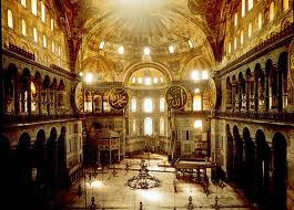
the pendentive is used in many churches, including the Hagia Sophia, which was the first masterpiece of Byzantine architecture.  the dome sits at the center of the building, and is 102 feet in diameter and 182 feet in height.  

another religious structure that uses the pendentive is the Sultan Ahmed Mosque, located in istanbul, turkey.  it is more commonly known as the Blue Mosque, due to the blue tiles that cover its interior walls.  the design of this mosque draws from a combination of Byzantine architecture and Ottoman architecture.  the interior is lined with over 20,000 handmade tiles in more than 50 different designs.  

Friday, February 10, 2012

music+design. TEAM ORANGE

A haiku about the World Trade Center Memorial Design:

Blue-colored light beams
Balanced above the city
Contrast the night sky

by Beth Lowder

Violet Group Architecture and Frozen Music

In circuitous motion and color,
plastic animals to be your caller.
Each layer it beams
a different value it seems.
Won't stop till you pay a dollar.

poem by Joylyn Waegerie

image:  http://www.flickr.com/photos/sjnewton/5231212932/lightbox/

design+music: green team


The cadence of the banister marks the rhythm of this piece;
As we climb, the repetition echoes from our feet.
There's balance in the spirals, harmony between each layer;
The emphasis on finale, ascending high into the air. 
 
alexander bissinger