Friday, April 17, 2009

Patina of Place: Reflections - Ethan Aiken

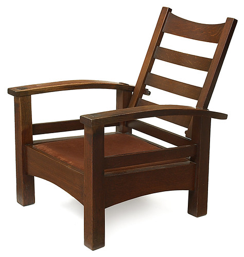
Artifact: Frank Lloyd Wright’s Furniture
Nature: Like some of Frank Lloyd Wright’s designs, some of his furniture also contained elements of nature.
People: The furniture was very sparse in his homes and designed more for the aesthetic and not for the use of people. This caused a few problems when people tried to live in them.
Material: Most of his furniture was made from natural materials.
Symbol: These pieces of furniture show the change that is occurring in the residential furniture. Furniture now is being designed to the room, instead of being made to serve any purpose.


Space: Crystal Palace
Nature: The greenhouse space is constructed primarily to house plants and other warm weather life. It has an impact on plant life (a good one) in a time of rapid industrial growth.
People: The people of this time period really enjoy these places because they become a grand place to hold parties and show off wealth. This impact is left in the minds of the lower classes.
Material: These buildings are made with the newfound materials, glass and iron. They are the primary reason that these types of structures exist. Without these technologies, buildings made primarily of glass would not be possible to construct.
Symbol: This building symbolizes man’s dominance over nature and their ability to capture living plants all year round. This leaves a new mark of superiority over nature.


Building: Marshall Field Warehouse
Nature: This building goes a lot against nature. It does not borrow any styles or themes, nor does it aid in the progression of nature.
People: This building was very important to people because it was a storage place for trade goods fro the Marshall Field department store.
Material: This building was built primary from stone, borrowing on the palazzo style from Italy.
Symbol: This building symbolizes the change to a society that focuses so heavily on trade and commerce. This idea is not new, but the level to which it is pursued is a great leap for society.


Place: Chicago
Nature: Though the city itself goes against nature in its industrialization, the architecture borrows a lot of styles and detailing from nature. Some ideas, such as leaves and trees, make a big impact on the detailing and bordering of buildings.
People: The people of Chicago embraced the changing times and were open to the new styles. The impact that they left set the bar for design style of America.
Material: Chicago employed a wide range of materials, spanning from new materials steel and glass to older materials such as concrete and stone.
Symbol: Chicago symbolized the pinnacle of architecture and designers. It was the ultimate place for advancement in the United States and (arguably) the world at this time.

Reflections Unit Abstraction: The Theatre of Everyday Life

The theatre of Everyday life in the new iron age brought people into contact with new forms of media and transportation that correlated with the creation of larger structures made of materials that blurred the lines of what is structural and what is decoration. 
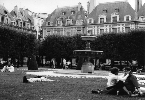
New agora-like spaces are created by the french townhomes as they are built into each other adjacently. Because they exist in a public space they are grander and are made with a grander facade; an example of how the lines between upper and middle class are blurred. This blurring is also accomplished through the media in that books and magazines on culture and court life hearken to the past court etiquette manuals of Renaissance times. A new emphasis on court life is also brought on by the iron age, in that many first structures are created for the purpose of upper class social gathering. Glass as a new building material also brings on a focus on nature and nature as an avenue for court life. With the Crystal Palace of London 1851 large existing trees were built around rather than cut down so that nature is now seen within and around architecture. Perhaps architects were trying to say that architecture can dominate and live in harmony with the landscape. 

With Ledoux' Saltworks complex he seemed to have a vision to create a whole town out of the complex. This way of building a city from a "corporate" establishment can be related to the Greek cities that first formed first from military camps. Ledoux designed the complex with sun in mind as the semicircle is cleared out so the sun can radiate about. Ledoux said "A good environment makes for a good human being" (unesco.org). With this complex it seems that architecture dictates the everyday life. 
Jefferson's Monticello is another classic-inspired self sustaining complex that manufactures and profits from its environment. 
Both of these complexes were made mostly of stone, concrete and brick.

If anything this period shows us how classic architecture may be more self sustaining than the iron age metropolises that were blooming. Because archtects seemed to focus first on creating the ultimate party house as well as creating structures for the machines, sustainability was sacrificed for the exploration of the new technologies that would challenge the classic city/town. 

Citations:
Roth, Leland (2007). Understanding Architecture. Westview Press.
Blakemore, R. G. (2006). History of Interior Design and Furniture. Hoboken, New Jersey: John Wiley & Sons, Inc.
Royal Saltworks of Arc-et-Senans. Retrieved April 18, 2009, from whc.unesco.org Web site: http://whc.unesco.org/en/list/203/video

Thursday, April 16, 2009

Reflections: Junctions

‘Reflections’ is most emulated in the idea of stylistic junctions and conflicts between ancient revivals and modern materials through France, England, and the newly reformed United States. I think this section is called reflections because the nations looked back to the past for revivals and ideas for future designs, the reintroduction of the Gothic style, the interest in foreign merchandise from trade routes, and the iron and class combinations all helped to spur changes and junctions between styles.

Artifacts of influence in this junction of design styles and ideas appear as trade goods of foreign cultures such as Asian influence clothing and china ware, and the plans from ancient designs. When the trade route from Asia to Europe opened a whole new influx of ideas and inspirations appeared and was appealing to the people of Europe as the designers of both nations attempted to design in a new way. Asian countries were changing up designs from their own china and goods to be more appealing to the traders of Europe while still giving away a little of their design flair. A term, used especially from the inspiration of Japanese trade and woodblock art was called Japonisme.

Space was an important idea to the English, especially when talking about landscaping in the early part of Reflections, based on the classical ideas of Palatio: Indigo Jones and John Vanbrugh re-worked the idea of landscape architecture with the Queen’s House and landscapes of Castle Howard. The English idea was to use the natural part of nature to create beauty in design rather then make nature more ornate then it really was. This less formal idea was a junction in that is transferred the idea of ornate gardens that were ostentatious to the beauty of nature itself.

Buildings such as the Crystal Palace and many other buildings of “Glass and Iron” were junctions in how everyone thought about design from the building materials all the way down to the building forms themselves. Everyone was so used to the idea of concrete, stone, and other past building materials that it was a major culture shock to use the new materials that interfered with the ways of thinking about Design.

The place each epiphany or junction in architecture and design took place in was an influencing factor on what the change was. In the European nations when the trades started from Asia, the people were influence by the Asian culture and the Asians were influenced by the European culture in order to create more appealing products to the people of Europe from the trade route.

The beginning of junctions between the revival periods that brought on the House of Parliament in England and the revolution of new material with buildings such as the Crystal Palace was a direct symbol of change and things to come in the future of design. It was a symbol that design would continue to move forward rather than be stuck in the ways of ancients and older ideals.

Chiaroscuro in the Reflections Unit

Cenotaph for Isaac Newton 1784
This structure was designed for Sir Isaac Newton. Its form was derived from the “round tumulus mausoleums of the Romans” (Roth, 450). It was built to have a cylindrical base supporting a pure hemispherical dome. This structure was going to be built by Etienne-Louis 
Boullee to explain Newton’s planetary mechanic theories.

The upper-shell was penetrated by pinpricks of daylight. The interior of the dome was black, and therefore the light showing through was a recreation of a “vault of the heavens”. This effect created by this building mirrors a camera-obscura effect because the tiny holes are projecting an image of the sky along the interior walls of this vault


Houses of Parliament London 1870
These Houses of Parliament are a primary example of the Gothic revival during the period of eclecticism. They were built after a fire destroyed the palace of Westminster. This design was the result of a competition, built by Sir Charles Barry and Augustus Pugin. The classical symmetrical plan was based on functional needs, but the exterior resembles a gothic cathedral.

In these houses, there are ten internal light courtyards. These courtyards utilize natural light. The light that comes through these courtyards allows for penetration through the windows of the halls and offices, etc. Courtyards provide fresh air and daylight for the building.


Crystal Palace London 1851

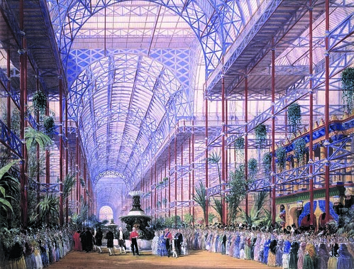
The Crystal Palace was built for the world exposition of 1851 by Joseph Paxton, who had previously designed greenhouses. This structure used the new technologies of iron and glass to overcome great expansions. The cast iron pieces were painted blue to merge with the sky above, and Paxton used glass to create translucency

Paxton created a transparent building that removed all visual limits, making the building seem nonexistent. This concept breaks the barrier of the building. His use of illusion mirrors the concept of illusion used in the previous unit, enforced by perspectives, to extend space. This effect that Paxton created served a new purpose as something that was very inviting and comforting within his space.


Robie House Chicago 1909
The Robie House was designed by Frank Lloyd Wright as the finest of all of his prairie houses, intended as a residence. Wright uses the technique of creating rooms within rooms, by subdividing his space not by interior walls, but by using extended horizontal lines throughout his rooms. He designed the rooms so that there was not one particular orientation, and every wall functions the same.
Not only in the Robie house, but in all of Wright’s buildings, he exploits natural light and hides artificial light. All artificial lighting in his spaces are hidden, so one never knows where it comes from. Wright also uses manipulation of windows, all sizes, to allow for natural light and allow inspiration to come from nature rather than technology.


Casa Mila Barcelona 1910
This building is based off of human forms and inspiration. It includes a singular line of fluidity among all its pieces. This building is an apartment building, and Gaudi designed every aspect of each space. All about organic shapes and naturalism, the building creates irregular walls that resemble plant systems and the exterior looks like a cliff by the seas of Barcelona. The balconies resemble tangled sea kelp. So overall, the building is inspired by the fluidity of the ocean.

This complex has four light courts, allowing light to penetrate into the building. It is said to “play in the sunlight” through its use of tiles that reflect sunlight in different ways. The organic form plays with light by creating a variety of organic shadows depending on the time of day and the direction of sunlight.

By Neal Mickey and Nicole Robert

Wednesday, April 15, 2009

Fingerprints and Footprints | Reflections Summary

||||Fingerprints & Footprints
leave an unique impression. Footprints represent a definite move forward, having a lasting impression upon history. Fingerprints leave a unique impression upon the face of history, but, unlike footprints are not moving forward.


http://www.flickr.com/photos/37996580657@N01/130971893

William Morris along with some others promoted hand-crafted artifacts during the Arts and Crafts Movement. Hand crafted artifacts are closer to nature than those made by a machine, and are generally made of more natural materials. They believed that hand-crafted artifacts also kept people out of factories and reduced the negative effects of industrialism, thus benefiting all people and their natural surroundings. These artifacts were intended for everyone, but only the wealthy could afford them, thus leaving a fingerprint instead of a footprint.


http://www.sawmillcottage.net/Castle%20Howard.jpg


http://www.flickr.com/photos/sfumatura_it/3373032904/

The gardens at the Castle Howard appear less formal, but are indeed carefully planned spaces, that though are from natural materials, are not natural because they are planned. Another interesting planned space were those of the emerging middle class, who wished to emulate the upper class in their apparent way of life. Large structures with the appearance of the home of a wealthy upper class family were built, but were in fact divided living spaces for the middle class or upper middle class. In the middle of these were open communal spaces, sort of like parks.


http://www.flickr.com/photos/dulwichonview/2424731509/


http://en.wikipedia.org/wiki/File:Gare_de_d%27Est_Paris_2007_a2.jpg

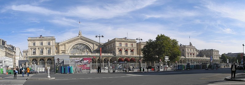
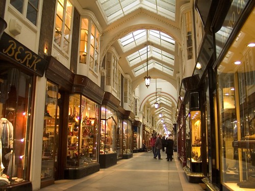
The technology of iron and glass made the opening of space possible. Not only did the glass structures seem larger because they appeared without walls and/or ceilings, but also were of larger expanses. An outstanding example was the Crystal Palace of London. Also, conservatories were built from these materials, displaying plants from all over the world—brought back by wealthy men from their tour. These buildings were used as party spaces for the wealthy elite, also promoting healthy, cleaner air. For the middle class, iron and glass also opened up spaces, specifically in the arcades, which provided entertainment, especially in the form of shopping. In the Southern United States, however, masonry was used as a primary building material, such as at Dayton Hall, as well as at UVA and Monticello, both of which we recently visited.


http://www.flickr.com/photos/khaugli/17107022/


http://www.flickr.com/photos/deegs/2068134591/


http://paaia.org/galleries/default-image/white%20house.jpg

As the United States grew, so did its urban areas. The nature of places was changing, as were the people within them. The city that underwent the biggest change was Chicago, due to a fire that wiped out most of the city, allowing fresh ideas in architecture to arise in that center. Cities became a place for people, as they were a center for politics and a source of more financial stability, especially due to the number of jobs arising there, particularly in factories. Washington, DC was built from the ground up with the intention of being as much like Rome as possible, symbolizing its stance as a Republic. The buildings within it, especially the White House, have become symbols for the United States and what it stands for.


http://www.flickr.com/photos/scottwrightphoto/3084511166/

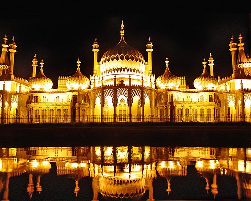
An interesting example of materiality in a place is the Royal Pavilion in Brighton by John Nash. The supposedly gaudy structure took around 35 years to complete, leaving its roots as a fishing cabin and becoming a sort of museum of Asian curiosities. It was criticized as being distasteful and over the top.

-Kristen Sylvia & Cassandra Gustafson

Tuesday, April 14, 2009

Aqua Vitae: Reflections

Aqua Vitae [Re]flections Unit--Honors Summary [RAGAN & YOUNG]
The water of life can be viewed and further extracted to reflect this unit in a more abstract sense. We viewed this sense of life meets water through the war, Industrial Revolution and this rebirth of antiquity. If one thinks of life and the qualities of water, then our abstraction makes perfect sense. Water is fluid and spreads quickly, touching everything in its path. Water is easily manuvered and can sometimes soak up and ruin any the things it interacts with. For example, the news, advancements in travel and so forth, can be viewed as the living water of America in the 18th-19th century. Faster travel led to more news about life and the news spread FAST.
Another example of this transportation and travel reflecting water and was of the east meets west idea of the times. The Silk Road and other such trade routes began blooming from all angles of the world. These routes led to the desire for “exotic” artifacts to be apart of European design. The World’s Fair of 1851 in London showcased many cultures and allowed for them to learn from each other, to intermingle and to influence and inspiring each other.
To switch gears within this unit, we discussed the French middle and upper classes and their relationship to one another. These classes were completely different, however, in the 18th-19th century, the middle class began to construct homes and have them resemble that of the wealthy upper class palaces. They created meager ponds in the center of their clustered homes in the middle class to try to reflect the large fountains and lakes of the upper class royalty.

Crystal Palace, 1851  Cultural mixing


Cites for images:  www.crystalpalace51.org/

Monday, April 13, 2009

Alternatives Unit Abstraction: The Theatre of Everyday Life

As humanism blosomed during the Renaissance, the focus shifted from religion to human accomplishment and human sustenance. Commisioned buildings and art became the norm in Italy and the rest of Europe effectively establishing a single patron or family as important members of society. Much like the Greek who sought "arete" and literally set thier accomphishments in stone, so did the everyday nobility of everyday Renaisssance Europe (Roth 215-246).
  Studies of the classic Latin texts of Virgil, Cicero and Grecian texts of Plato and Aristotle (Roth 353-396). Vitruvious' "Ten Books On Architecture" describes Philebus-how the human body is built into the scale of itself and that circles and squares can be found in these human proportions. Brunelleschi's foundling hospital was an example of a structure measured in human proportions. Humanism was somehow resurrecting classic forms as in columns and arches in relation to human proportion. Andrea Palladio ressurected the collonaded portico for private homes (Roth 353-396). 
Starting with Elizabeth I, fortified dwellings and structures began to "open up" in terms of adding large windows and walls with engaged columns (Roth 353-396). Large yards and gardens would begin to introduce the home. Gardens were also arranged in axial arrangement to influence movement. Windows opened to the outside gardens and inspired the gardens to grow. A deeper connection grew between human studies and nature as man's natural proportions became more evident as the vessel of architecture.

Castle Stokesay (England) Has larger windows than previous high fortified castles
gallery.nen.gov.uk


community.livejournal.com
Citations
Roth, Leland (2007). Understanding Architecture. Westview Press.