Friday, March 27, 2009

Patina of Place: Alternatives - Ethan Aiken

Alternatives Unit:

Artifact: Staircase at the Library of San Lorenzo

            Nature: The stairs in the Library of San Lorenzo reflect a cascading waterfall in the design. This emergence of natural elements and patterns are very characteristic of Renaissance.

            People: This artifact is very important for the people because it provided entry to this new place of collected knowledge. This impacted the environment, or rather, the people in the environment very greatly. It let them move from place to place with ease and make it less challenging to gain knowledge.

            Material: The staircase is primarily made out of shaped stone and marble. The way the stone is shaped, however, it reflects moving water in its form.

            Symbol: This staircase is a symbol in many different ways. The first way is that it symbolizes the rise to knowledge and the journey that each step of the journey represents.


Space: Piazza of Saint Peter

            Nature: This area in front of Saint Peter’s goes against nature on every level. Where there would be trees and grass, there are pillars and stone. This space also brings order to the disorder of nature.

            People: This space is a grand gathering space for the people of the area because it is one of the few areas that people can gather together outside.

            Material: This area is mostly stone and contains fountains, adding a thin layer of natural elements to this unnatural space. The theme of water is prevalent throughout the city.

            Symbol: This area is constructed so that they surrounding structure resembles outstretched arms, showing the welcoming feel that the church is encouraging.

Building: Versailles

            Nature: Like the other structures of this time, this grand building chooses the order of the built world over the disorder of natural world.

            People: The people of this time did not approve of the construction of this palace and to show their discontent, a revolution arose mainly because of this building.

            Material: This building did not spare anything in the construction. It had the finest stone and glass, as long as a grand hall of mirrors.

            Symbol: This building was the symbol of grandeur for the owners and revolution for everyone else. It inspired outrage at the thought of the waste of money during this difficult time in history.


Place: Venice

            Nature: This floating city defies nature entirely. This area is built on top of logs lying on top of a swamp. This city is also very ordered and

            People: This city shows the adaptability of the humanity. The people adapted from land to water.

            Material: This city is made of many different materials. The base is made of wood and water, leading to the next layer of stone. The buildings on top of this are made of many different materials such as marble, stone, and wood.

            Symbol: This city symbolizes the resolve of the human spirit. They live with many challenges every day and have built a beautiful city up from the swamp.

P A T I N A O F P L A C E

I. Place::Heaven
A.  Nature:: Earth versus Hell versus Heaven.  After the year 1000 people thought the world was going to end and everything left on Earth would descend into Hell.
B. People:: People's religion greatly influenced the aspect of faith Incorporated in design
C. Material::Heaven was portrayed through the use of light via windows, glass and water.
D. Symbol::The Heaven role in architecture and design depicted the peoples beliefs of afterlife.
II. Building: Versailles
A. Nature:: The landscape of Versailles was important just like the architecture itself.
B.  People:: Versailles was like people linking arms and standing together to seem stronger.
C.  Material:: The material of Versailles was strong and elaborately decorated.
D.  Symbol::  As found in nature the same concept of a school of fish was portrayed in architecture by smaller, uniform buildings connecting to give off a more powerful and grand appearance.
III.  Space::Vitruvius' idea of rational proportion within design::'the space between'
A. Nature::  Proportions are found within nature: example: shell
B. People::  People look for order in everything.
C. Material:: this concept was depicting through many types of material and all forms. Ranging from the shell to landscape design to the material used for the building itself.
D. Symbol::  This concept symbolized order and clarity
IV.  Artifact::Landscape
A. Nature:: Landscape design was redesigning something that is found in nature and relating it to architecture and the community.
B.  People:: The English gardens were more formal compared to the French; this gave insight to the peoples culture.
C. Material:: All material was found in nature and accentuated to a hilt.
D. Symbol::  Landscape symbolized the people's culture, beliefs and traditions as well as reflecting architectural concepts.


Aqua Vitae for "Alternative" unit

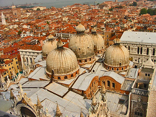
Throughout "Alternative" unit which contains the Medieval period, Renaissance, and Baroque, Venice (Venezia in Italian) need to mentioned under the topic of "Aqua Vitae" because Venice is a city of floating stone; in other words, a city on the water(sea). Venice was built by the principle of utilizing wood to construct the base of Venice. The great example of use of water shapes history of architecture is Venice.


Above image is from flickr.com


By Kristina Ragan and Young Moon

Thursday, March 26, 2009

Chiaroscuro in the Alternatives Unit

Amiens: France 1250

Amiens Cathedral, or Notre Dame, is the tallest cathedral in France, and is representational of Gothic architecture. This cathedral is the exposition of a whole: consisting of decoration, form and structure. It interrelates horizontal and vertical elements, and incorporates human figures in its facades.

In this cathedral, the use of windows allows for the reception of light. The light infiltrates the nave of the cathedral, making obvious the presence of God. From many standpoints, light falls into the space, however, the source is unclear.

Duomo: Italy 1436

The Duomo, also known as the Florence Cathedral, ends the Gothic era and marks the beginning of the Renaissance. It is well known for its dome, designed by Brunelleschi, and its illustrated façade. It is the chief landmark of Florence and acts as a way to show civility through transformation from public to private.

The use of circular windows is important in the entrance of light in that it is the main source of natural light. The Florence Cathedral has a white interior, which emphasizes the light entering the cathedral, creating more light than expected.

 Cologne: Germany 1560

The Cologne Cathedral, also known as the Kolner Dom, was the worlds tallest structure until the construction of the Washington Monument in 1884. It is a monument of Christianity and Gothic Architecture. It was built in dedication to St. Peter and the Virgin Mary.

The use of adjacent windows allows for maximum light entrance in the Cologne Cathedral. Not only do the windows light the nave, but the spire also allows for light, creating an interesting composition. The most light is found at the apse, making the priest the most important figure in the cathedral.

Salisbury: England 1266

Unlike the previous cathedrals, this one is not Gothic, but Romanesque. It is considered one of the leading examples of Early English Architecture. This cathedral contains the world’s oldest working clock and one of four copies of the Magna Carta.

In this Cathedral, the complex ceiling structure plays a huge role in the incorporation of light. 
When one stands in the Salisbury Cathedral, it is obvious that light is coming through, but the question is- where? There is so much detail in ceiling structure that it is almost impossible to define the exact source of light. Also, with the way the light enters the cathedral, it resembles artificial light, though it is actually natural light. 

Foundling Hospital: Italy 1424

This building was designed by Brunelleschi, with the use of circles and squares and cubes to determine proportion (Roth, 362). It aims to create “the perfect façade” through symmetry and repetition of columns. However, behind this façade, the space is asymmetrical and the columns in the courtyard are unaligned.

The colonnade creates a concept of repeating light and shadow, enforcing a sense of intimacy upon the people it functions for. There is also a slight use of light and dark colors in the blue rondels with the white babies.

Santa Maria Novella: Italy 1471

This church is the first great basilica of Florence. This is an example of the beginning use of a temple inside a temple, creating one façade out of two floors. The façade is illustrated so that it looks like it had been pasted on, and it uses a central rose window to symbolize its function.

The use of light in this building has more to do with the façade. The light stone and dark stone are placed in geometric patterns, creating an architecture parlent.

Palazzo de Medici: Italy 1460

Built for the Medici family by Bartolomeo, this building reflects inspiration from both Roman and Brunelleschi principles. The palazzo form serves for business, entertainment, and family. The Front façade and its disappearance of rustication is one of the main ideas in this building.

The oversized cornice is set at a city scale, and overshadows the city. The roughness of the exterior lessens as the view goes from the bottom to the top, causing a gradation of shadow in texture from dark to light.

Villa Rotunda: Italy 1550

This villa was designed by Palladio, and was the beginning of “breaking the rules” by putting a temple-front on a square space. This villa was built as a “home away from home” or an escape from city life. This building was never completed by Palladio, and was taken over by Vincenzo Scamozzi.

Palladio’s idea of putting a temple-front on a home led to this idea of making something sacred from scratch. After being taken over by Scamozzi, he decided to further this emphasis of holiness with an oculus, which he installed in the top of the dome. In the exterior, it is unclear that light would be able to fill the building, but in the interior, it seems to be overwhelmed with light.

Sistine Chapel: Italy 1483
The Sistine Chapel is a famous church in Italy designed by some of the most famous Renaissance artists including Michaelangelo, Raphael, Bernini and Botticelli. The architecture is almost surprising. If you look at the exterior, it’s bland and monochromatic. One would never think that the inside would be as beautiful as it is.

The Sistine Chapel is most famous for its frescoes painted on the ceiling as well as on the walls. These Frescoes represent chiaroscuro in both the literal way and the interpretive way. First, the art of chiaroscuro is shown through the light and dark values used to illuminate the human figure. This use of light and dark in perspective causes the transition from the wall to the ceiling to disappear, so that the space is extended. Second, light in chiaroscuro is shown through the use of windows in the nave. These windows allow light into the chapel, which first illuminates the ceilings, and then reflects from the ceiling to the walls on the sides.


Chapel of Four Fountains: Italy 1638

This church was the first church in Italy to be built by Borromini, dedicated to the Holy Trinity. The name of this chapel derives from the four fountains, which can be found at each corner of the church. The façade incorporates much undulation, or movement of the eye.

The use of light in this church comes primarily from the oval shaped dome in the center of the ceiling. The light that travels through the small windows within this dome is a “white” light, and it almost seems filtered, because of how softly the light falls into the church.

Piazza St. Peter: Italy 1667

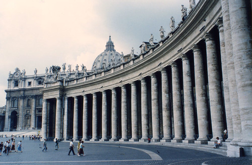
This piazza was designed by Bernini. This space is defined by its oval shape and its consistent use of colonnades to imply enclosure within the space. The oval shape can be interpreted as “arms reaching out” from the church along the borders of the piazza. Bernini designed the piazza the way he id to create a sense of order among the city. The piazza is built at city scale, and is an example of Uniformity within the Baroque era.

The use of the colonnade in the Piazza St. Peter plays a huge role in the design itself. The shadows cast by the colonnade create a transition from exterior to interior, in that as soon as someone enters the colonnade, he or she feels like they are in a private area, or a refuge from light. It is also extremely useful because as someone is standing in the middle of the piazza, they might become extremely hot, and then once they walk into the colonnade, they are safe from the heat of the day.

Hall of Mirrors: France 1688

The Hall of Mirrors is the biggest room of the Palace of Versailles. It gets its name from the seventeen mirrors facing seventeen windows overlooking the garden. The Hall of Mirrors links the exterior and the interior through its illusion of reflection. The furniture and architecture within this hall are based on the mirrors themselves.

The Hall of Mirrors uses light through reflection. Light enters the room, through the windows, reflects off of the mirrors, and expands throughout the room. This light is symbolic of “heaven on earth”. The Hall of Mirrors is the most well lit room in France, and not only does it use natural light, but also chandeliers. The chandeliers also reflect in the mirrors, and are more effective at night, while natural light spills into the hall during the day.

By Neal Mickey and Nicole Robert
Photos taken from Flickr

Alternatives: Fingerprints & Footprints

ARTIFACT

Nature

image courtesy w_a_b @ flickr
One of the rooms of one of the greatest known buildings of France and Baroque, Versailles is the Hall of Mirrors, in which the highly controlled landscape is reflected in the mirrors (artifacts), visually expanding the amount of space perceived. Gothic Cathedrals utilized light as a natural artifact.

People

image courtesy Badulake Mahapralaya! @ flickr
The highly expressive image of St. Theresa in the Capella Cornaro, as an artifact, evokes emotion in the viewer, especially in the church setting.


SPACE

Nature

image courtesy Gibna Kebira @ flickr
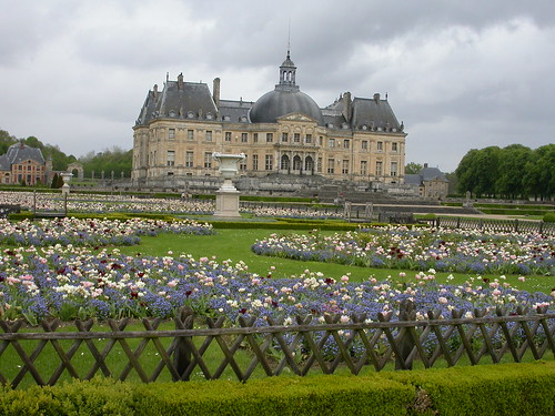
The gardens of wealthy estates created spaces by manipulating nature in carefully planned gardens, such as the ones at Vaux-Le-Vicomte. In France, these gardens were highly formal, while in England they appeared more natural and informal but were no less planned than those in France.

People

image courtesy Memento @ flickr
The dome, such as those of the Renaissance church, Basilica San Marco, creates a conducive and awe-inspiring environment for large groups of people by expanding the space vertically. Also, in the Baroque period, public spaces, such as The Piazza Navona, created a space for people to gather and circulate through. Water is used here to emphasize “clarity, fluidity, and light.”

Material
The Capella Cornaro by Bernini in the Baroque period uses a strong sense of material similar to the Baldacchino in that the artist shaped the material, marble, to look like fabric.

image courtesy .Fabio @ flickr


BUILDING

Nature
Gothic cathedrals stretched the nature of the materials used. This sometimes caused collapse or near-collapse of the structures. Flying buttresses were conceived as an alternate structure to carry the weight.

People

image courtesy Piotr Sobczyk @ flickr
The Scalinate di Spagna is a well-known space for meeting and congregation. The importance of water in the Baroque period is illustrated here not with water, but with people flowing up and down the stairs.

Material
Ste. Madeline, a pilgrimage church constructed in the Renaissance, was constructed to bring awe, especially in the details, including snakes. These details, also used in other periods, began as an alternative source of information for a mostly illiterate (in the sense of reading and writing) society.


PLACE

Nature

image courtesy Luigi FDV @ flickr
The Trevi Fountain uses nature in a way of materials by incorporating water flowing over the structure and light reflecting off the water. In the Baroque spirit, it is a very organic, and peaceful place, created through its involvement of natural elements.

People
In the Renaissance, “Old” St. Peter became important for Christianity as it served as a gathering place for the community.

image courtesy mambo1935 @ flickr
The Baroque addition of the Piazza di S. Pietro by Bernini creates open spaces, connecting along boulevards in the city plan, which brings overall order to the city. It also enables a power structure, which tells people where to drive or walk.

Material
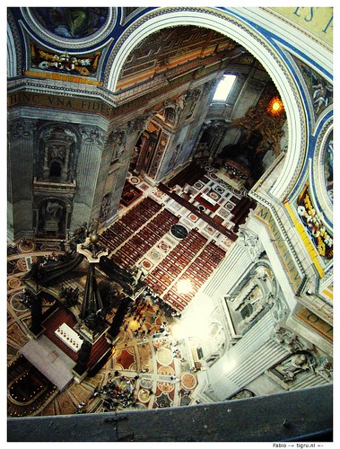
Bernini’s Baldaccino is a great example of Baroque’s importance of material. In this piece, Bernini created the surface to look like fabric. This aedicule creates a specific place within a greater space.

Symbol

image courtesy Luca Zappacosta @ flickr
The Duomo of Florence became a symbol of that city. Another example is the Abbey Church that symbolized the need for order within chaos- a Renaissance principle. The Baroque, highly formalized gardens of Versailles manipulates the landscape “as far as the eye can see”, showing the power of the king.

Alternatives: Junctions

The chapter summary of Alternatives was filled with very contrasting periods in architecture and art. The renaissance being the period of enlightenment and a junction for knowledge and rules for the people and the Baroque/Rococo bending these newly written rules and focusing on the more frivolous and luxurious side of art and architecture. All this transition between styles and buildings as effect from them are quite a far leap ahead of the previous chapter on ancient civilizations discussed in Foundations, the junction between the two chapters and their periods of architecture and design is vast because of new use materials and people’s ideals presented within them.

[An example of Renaissance Architecture]


[And example of Baroque Architecture]


Between the renaissance and the baroque period of Italy and France, there are many things that contribute to the junctions and intersections between the two stylistic periods. The concept of space within a building was very linear and straightforward in the time of the renaissance and was very blurred and imaginative in the baroque. A best example of this dynamic change in ideal would be between the St. Maria Novella in Italy during the Renaissance, with its ancient world ideas and geometric layout, and the palace of Versailles during the Baroque, with the frivolous curves and overly grand appearance. This junction, being the change in styles between clear-cut and vague, was especially apparent when it came to the lines that differentiated the walls from the ceilings. Artifacts present are simply those elements and ideals of architecture in the two periods, the written rule as mentioned before and the buildings themselves that followed or broke these rules.

People were the cause of the junction between the two periods of the Renaissance and Baroque period. Religion was a major catalyst in the crossroads between the styles along with emotion being added as a key element in architecture especially in the Baroque period. Junctions also occurred within the countries themselves like with in Italy going from a city ruled but the church and clergy to being ruled over with influence from the merchant class that helped to contribute to the city. Materials of the time really didn’t add to the junction between these periods in the chapter, it was more of the ideas used to transform the materials that was the definition of junction, in the Baroque period of Italy and France, plaster was molded into curly and curvy shapes around fresco wall paintings that were key to the frivolity of the period itself while in the Italian and French Renaissance it was more linear or geometric, still taking inspiration from ancient times and their architectural ideas with the column orders and symmetry.

In conclusion, junctions in design and architecture were most identifiable in the stylistic transitions between the Renaissance and the Baroque period, the majority of this junction idea appearing in the forward thinking countries of France and Italy. While this change was also happening in England as well, it was more apparent and contrasting in appearance in France and Italy.

::Sources::
Chateau de Maisons Picture
The Duomo Picture

Foundations: Junctions

Originally posted here on March 1.

[Abstractions of Junctions]

Junctions can be found in and between design along with the culture that influences it. A junction by a definition that is not abstract is a place where two or more things come together, I think that this can be interpreted in a physical state or in the abstract sense of something not so literal in interpretation.

Artifacts
Artifacts themselves are story telling tools for past and present on how a space or something in nature can be categorized as a junction. A literal interpretation are street signs at a major interception, one or more roads coming together, telling the people interacting in the area where to go and how to go safely as artifacts for the space.


Nature
Junctions can occur in natural things as well as things that are man-made. In the beginning of the idea of creating something successful in architecture and design, the early Mesopotamians used nature incorporated with their designs by utilizing the land's curves and building with the land. It wasn't until the Egyptians, later leading to the Greeks and Romans formed a rift in this ideal and started building against the land or on top of it that a junction or crossing of ideas in the way things were thought to be successful design, two ways of thinking, one a more dominate change for centuries to come in the world of design and still a major influence in our own lives and how we view design itself.

People
A way to think about junctions in terms of people makes me automatically think about when we delved into the Roman chapter and learned about the Romans and their superior idea of building things to glorify Rome and make Rome most important. Though a system of roads isn't really anything of great grandeur it is considered a junction in a physical sense because the large distance the roads expand to intersect with neighboring cities and towns to connect all the Roman empire together. It is a junction in that people are constantly walking through the intersections of road and seeing others.

Space
Space withing pieces of architecture can create junctions for people as an idea of circulation through out an area with many people interacting within it. As a modern day example, the Moore Humanities building [MHRA] has a sense of junction within a spacial area. People come and go throughout the normal class day, interacting and intermingling with people coming ad going to class as well as teachers coming in and out. The train terminal of Grand Central station is the epitome of a junction as a space with the coming and going to trains and other systems of transportation from place to place with people in and out of New York City.

::Sources::
Roman Road image and added information

Friday, March 20, 2009

Foundations Unit Abstraction: The Theatre of Everyday Life

How is a civilization's daily life reflected through their architecture? From studying structures, furniture and other artifacts we can trace the origins of past civilization's interactions and ideals. 

Egyptians-
The Egyptians incorporated nature into all of thier building, as the nile river was one of the main sources for their limestone material for building all structures. Pyramids were made of the local stone materials creating a contrastingly large structure which blended with the sand of the desert. Egyptians furniture turned to animals in linkage to nature. The legs of furniture would often have animal like feet turned forward to show the natural position of the animal. Hieroglyphics often featured animistic figures to represent letters, words and meanings. Because cats were so greatly revered, they were seen as protectors of the people. They were domesticated by the Egyptians in 200 B.C. and were utilized in hunting parties to catch fish among other small game. The sphinx- another cat form is the symbolic protector of the land made by Pharaoh Kafre (4th dynasty).    
Although they eventually created chairs with slanted backs we see that early furniture as well as heiroglyphics of ancient Egypt dictate that straight posture was a large part of their ideal human form. Furniture such as chairs often had very straight backs, head rests placed on beds were like cradles for the head which would maintain straight posture even in sleep. The emphasis on straight posture may be related to cats as they were highly revered for their aristocratic manner conveyed through their prancy straight gait. 
Nature is also part of the very symbolic culture of the ancient Egyptians in that the sun, cats, the nile river among other things had vast importance to religion and the theatre of everyday life. Large ammassments of slaves were gathered in order to take on the pharoah's many building projects. They created pyramids to build up to and point to the sun. They were a physical manefestation of their pathway to afterlife. The nile river was another physical manifestation of the division of life and afterlife. The east side of the nile is life while death or the afterlife resides on the west side. In Someone's tomb all of their belongings such as furniture, slaves as well as pets are buried with them so that they may use them in the afterlife.
 

Greece-
Natural designs were reflected in Greek columns: The volutes of the ionic columns were related to ram or goat horns, Corinthian columns were based on acanthus leaves. Their furniture was also animistic in that the feet were modeled after animal paws. They differed from Egyptian design in that the paws were turned outward rather than in the direction the animal faces. Wealthy people showed hierarchy through the feet of chairs in that the feet were often on top of carved "reeds" to symbolize that the ruler's feet never touch the ground. 
Architecture was based on the symbolism of the the Greek gods as each city was modeled after and based on a the story of a god. Outside of the Erectheion in Athens, Athena was said to have beaten Poseidon in a fight in which Athena won therefore naming Athens after herself. The temple of Athena sits on the acropolis amongst the Erectheion and the Parthenon.  
The People of Greece sought to achieve "arete" meaning "quality and excellence attained from fine testing and refinement" (Roth 215-246) so that they would be immortalized through their accomplishments. This is evident in various facets from their orthogonal planning to their fine lined columns and temple cornices. A focus of democracy began through this: demos meaning the people and cracy meaning governed by the people. Although this truly meant only land owning free white men could vote there was still a great focus on civic interaction through the creation and use of agoras, theaters, and coliseums. 
Stone was the primary material of the Greeks. Forts were created in the defense against the surrounding "barbarians." Stone is also permanent relating to the immortality of arete.

Rome-
Structures such as theaters were built into hillsides so as to create a natural backdrop to the stage. Natural designs were also in their furniture continuing the tradition of animal forms. 
The Roman person was based on militarism and duty to the state. They refined past people's designs as well as the greeks through their engineering in aqueducts, roads, and arches. The Romans adapted their religion to be like the Greek religion of the Olympian Gods. Like the Greek the Romans had a large emphasis on civic life and like the Greek agora they had forums- spaces outlined by the basilica and other buildings. The emperors of Rome dictated much of the Roman culture through free entertainment and the architecture of theaters, baths, and stadiums. Bathhouses built on top of natural springs or fed from aqueducts cycled into the Roman's daily life. The typical roman would work from sunrise till noon, visit the bathhouse for the rest of the day then return home for a relaxing dinner. 
The Romans continued the use of stone as well as concrete and created new forms of columns such as composite columns- combinations of ionic, corinthian as well as influences from other designs.  

Citations-
Springer, Ilene (2001,4,1). The Cat In Ancient Egypt. Retrieved February 28, 2009, from touregypt.net Web site: http://www.touregypt.net/magazine/mag04012001/magf1.htm
Roth, Leland (2007). Understanding Architecture. Westview Press.

Friday, March 13, 2009

Kristina Ragan: Aqua Vitae One


Fountain of the Naiads Inspired Michelangelo and Vanvitelli use to create this bascillica.
Basillica Santa Mariadegil Angeli.

Aqua Vitae—water of life
Within the foundations unit, we have discovered what it means to have beginnings, details and eventual influences that led into hybrids in the history of architecture and design. Tied in amongst these ideas, aqua vitae or rather, water of life.
Aqua vitae was most prevalent in the Diocletian Baths with the groups gathering as apart of their culture, the city gathered to bathe in these elaborate baths made of tiles and stone. These baths were areas where living people encountered water and used water in a social context. Pliny the Elder, “if anyone will consider the abundance of Rome’s public supply of water, for baths, cisterns, ditches, villas; and take into account the distance over which it travels, the arches reared, the mountains pierced, the valley’s spanned—he will admit that there never was anything more marvelous in the whole world.” This is saying that water was a prime and an abundant resource that was waiting to be utilized and was eventually recognized for its great necessity. Water was not just a social scene or hygienic means of cleansing, but was also necessary for travel in Greece. The islands in Greece needed to trade and use the water ways to get the resources they needed and revenue via trading with other countries. Therefore, water was a foundation for business and/or trade, décor (fountains and so forth), travel and hygiene.
In conclusion, water gave life an opportunity to live and thrive. Water cleaned the living and provided for design inspiration and gave cause to effect. Water birthed architectural foundations and created new, useful spaces for the public. The very nature of how society once lived has been changed by the use of water.

Saturday, March 7, 2009

Junctions, D.C. Shelton

Junctions can be found in every lesson of the Foundations Unit. A junction is a meeting of two or more ideas that combine into one. With design it can apply to a multitude of things: man verses animal, architecture verses nature, light verses shadow, natural verses synthetic, etc. In architectural history, the most common junction is of one culture borrowing from the ideas, styles and technologies of past cultures. These joinings can be smooth and seamless or can contrast.
The ancient Romans were the masters of borrowing from other civilizations. They did not try to hide their Greek columns, even their gods and goddesses, nor their Egyptian obelisks. Columns that the Greeks evolved and perfected and used for structural support were used by the Romans as pilasters adorning the facades of their buildings. The Romans also erected massive, freestanding columns, an idea from the Egyptians, as symbols of masculinity, victory and pride. Also like the Egyptians, they would carve images into their stonework to illustrate stories of war and triumph of the benefactor.

Roman & Egyptian Column
Also, Romans were very imposing upon the landscape. Unlike the Greeks, who would build with the topography of the site, Romans would cut out and level and build up the site until it was like they wanted. For example, a Greek designer would build an amphitheater on a hill, where the slope of the land would serve as the basis for seating. Romans, however, as shown in the Coliseum, was built without regards to the terrain.
Other junctions can also be found within design, such as the decision to use local or foreign materials. In Egyptian architecture, buildings were predominately made out of the very sandstone of which their landscape was made. This is a practice that makes some things easier, such as traveling expense and labor. Using local goods help to blend architecture into the landscape and make it seem like it fits its environment. Greeks and Romans also used materials that were more readily available. But, as was the case in the creation of Stonehenge, some designers choose materials that are not local. The stones used for it came from a location very far from the site. This decision not only preserves the local landscape from mutilation, but it makes the structure stand out from the architecture.

Classical Orders
One thing that the Romans did to make an idea their own was to put their own style into it. Their use of columns was often more ornamental unlike the Greeks who used them for load bearing properties. Also, Romans first developed arches, domes and concrete. These three components made everything that they were used in unique. Arches opened up a huge new venue of possibilities to the world. Concrete allowed a brand new surface treatment to be used on buildings which could be molded into any shape and would offer great support.
Junctions, overall, are more common than people may think. It is very important to learn from other peoples’ designs, technologies and artifacts. You never know what you might be able to use of theirs if you can put your own spin on it to make it functional for your visions.

Friday, March 6, 2009

Honor's Abstraction: Patina of Place - Ethan Aiken

Patina of Place: In a description of the book, Patina of Place by Kingston Heath, the writer talks about a very important idea called “Cultural Weathering”. This idea looks at the way society can leave a “cultural imprint” on the landscape and the way that the environment influences the structures that are built on it (Project MUSE). In this specific unit summary, I will address the city of Athens in Greece and observe how the landscape affected the way that the people designed their structures and the way that their structures modified the environment. I will look at many different scales of objects, ranging from the chair to whole cities. Through observation of the differences in these scales, one can find characteristics that apply to all ranges of scales and cultures.

Subject: Foundations:

- Artifact – The Chair

- Nature: The chair is not a naturally occurring object in nature. This divergence from the natural path shows

- People: This artifact was very important to the people of this time period. We can see this through the elaborate designs and sturdiness of these pieces of furniture.

- Material: The chair, being a smaller item, was normally made out of cheaper natural materials such as wood and leather. A change in materials, such as using stone or marble, could show a difference in status to the people of town. The more rare the material was, the higher the status it reflected.

- Symbol: The chair symbolizes the leap from sitting on the ground to creating a special device that is used only to sit on. This shows the advancement from a primitive culture to a more civilized one.


- Space – The Forum

- Nature: This aspect is possibly the most important to the forum style. Since it is no more than an open space in a city, nature plays a large role in its creation. There was not much modification to the landscape in this building style and people adapted to whatever the land gave them to work with.

- People: The forum’s only purpose is for the people. It is a place for people to gather and engage with one another in socialization and commerce. It really has no other purpose that this.

- Material: The main materials that existed in the forum were found underneath the peoples’ feet. On top of the ground was a layer of stone, providing a defined boundary for the area.

- Symbol: The forum is symbolic for many reasons. The first and most obvious is that it represents a place for socialization with others of a like society. This is the place where the members of a town could gather to talk about the daily occurrences or events that took place. The second reason was that it was also the economic center of town. Since this was the place for people to gather, the merchants took advantage of this. You could find just about everything you needed to live comfortably in early civilizations in these areas. This area was also a gateway for people that may have traveled to a new area. They could go here to meet new people and learn about the community.


- Building – The Parthenon

- Nature: The designers of the Parthenon took advantage of the natural surroundings when they created this structure. It is at the highest point of the Acropolis and it can be seen throughout the town. In this way, it uses the natural world to proclaim the might of man.

- People: This people were very important to this building because it was created mostly to play to the “Delight” portion of the design triangle. The only function it served was as a temple and it was used only for that purpose.

- Material: The materials that are used in this building are all very strong and sturdy. The stone and marble show the “Firmness” of this building and the materials have certainly stood the test of time, surviving from then to the present.

- Symbol: The Parthenon symbolizes how far that humans as a people have advanced. This building serves no other purpose other than to provide a place of worship for the goddess Athena. Humanity has now reached the point in time where they can build these grand structures not for the use of their people, but mainly as a symbol of the goddess.

- Place - The Acropolis

- Nature: The Acropolis, which is built on top of a plateau, uses the environment to its advantage. This place is the highest spot in the town and it can be seen anywhere in the city. In this case, the natural environment added to the majesty of this site.

- People: This place was very important to the people of Greece, especially the ones that lived in Athens. This site was a place of pilgrimage and every so often, special ceremonies would be held in honor of the goddess.

- Material: The materials that make of this site are primarily stone and marble. Because stone is such a resilient material, the use of these materials reflects the immortality and everlasting symbol of power that the goddess is known for.

- Symbol: Every one of the structures at the Acropolis is amazing, but together they symbolize the might and building prowess of the people that designed and constructed them. The fact that there is more that one grand structure goes further to show their might as a people.

In the case of Athens, Greece, we see that people are still building with the environment instead of against it. There is an idea of opposition beginning to emerge, however. On the artifact scale, we begin to see a divergence from the previous styles of building with the established environments. We also still see the environment playing a role in the design process. In the cases of the Forum and Acropolis in Athens, we see that they are built around the existing environment and take advantage of natural occurrences.

"Project MUSE - Technology and Culture." Project MUSE. 2009. The John Hopkins University Press. 2 Mar 2009 .